Chaney Family Dentistry
The thing that actually made this practice different was that they refuse to sell you work you do not need. The job was to get that into a mark.
Chaney Family Dentistry is a father-and-son practice in Vallejo, California. In early 2021 I built them a full brand refresh — logo, palette, tagline, illustrations, staff portraits and sourced photography — which then went into their new website, along with a suite of printed material.
Before and after
The family name Chaney means oak, and an oak already sat at the center of the old mark. They wanted to keep the tree and lose everything around it.
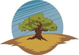

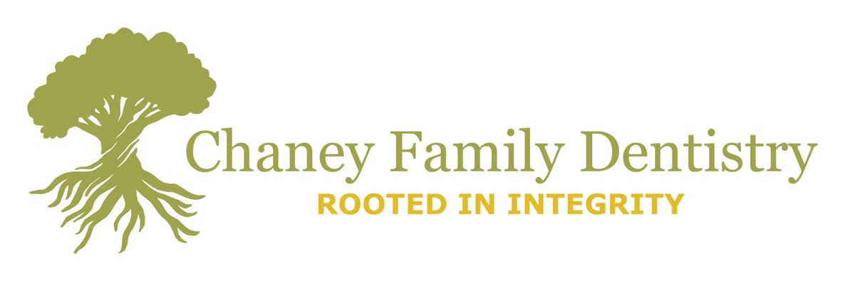
the horizontal lockup, as used across web and print
Where the mark came from
Talking to Dr Alex Chaney, the thing that kept coming up as the difference between his practice and every other dental office was ethics: they are firm about only recommending procedures that are genuinely needed. Not a soft claim — a policy. That is what the mark had to hold.
So the tree is drawn in two equal halves. Canopy above, root system below, roughly the same mass either side of the ground line: the part you can see is only ever half of it. The tagline that came out of the same conversation is rooted in integrity.
And because this is a dental practice, the roots are doing a second job. A tooth has roots too, in about that proportion, hidden in about that way. The mark reads as an oak first and a tooth second, in that order on purpose.
The palette
Seven named colors, built to feel like walking through an oak grove — trust, calm, warmth, steadiness. In a room where people arrive nervous, that is the whole brief for color.

the palette sheet as delivered — four greens and golds above, three neutrals below
hex values sampled from the delivered logo files — every variant was cut in its own named color
The team, drawn
The old site had photographs of the dentists and staff shot at different times, in different light, against different backgrounds. Individually fine. Together, a wall of mismatch — the visual equivalent of the appointment cards that had come from four different printers.
So everyone got drawn instead. Same line, same olive ground, same crop, same eye height. The team page finally reads as a team.
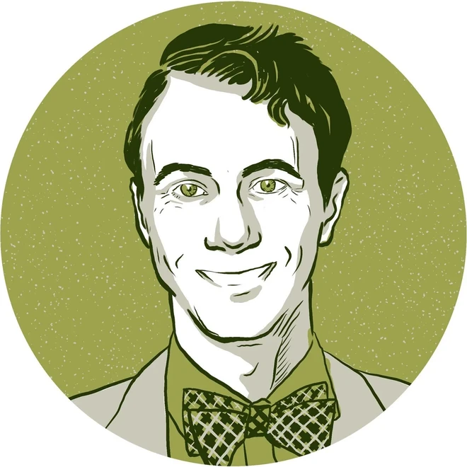
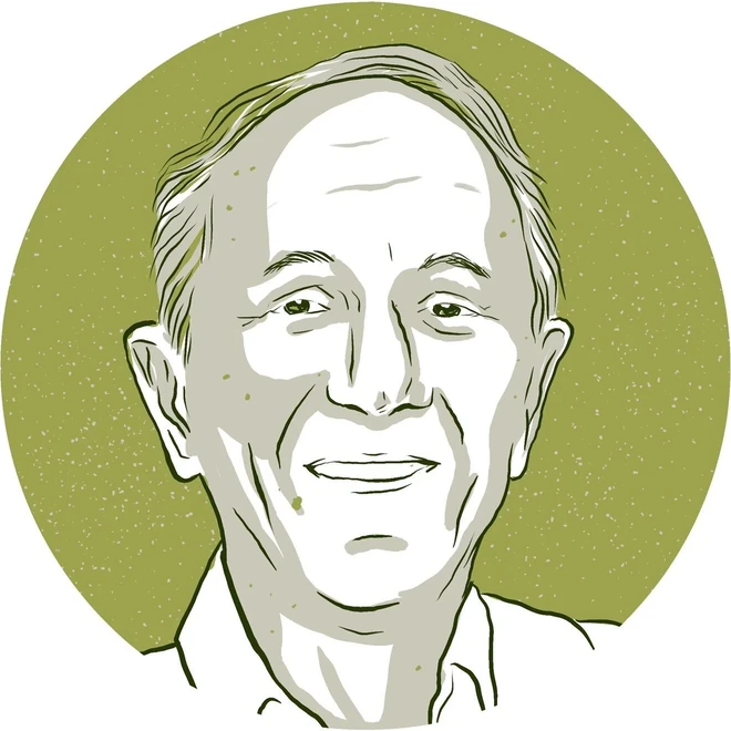
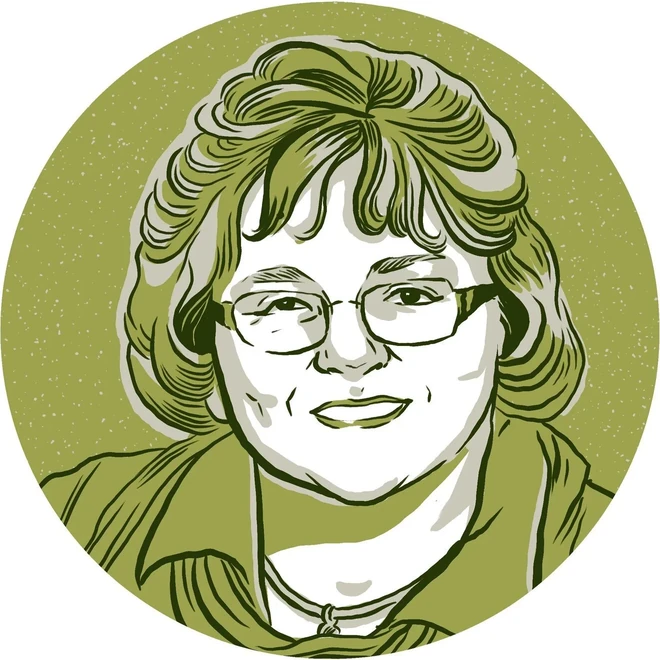
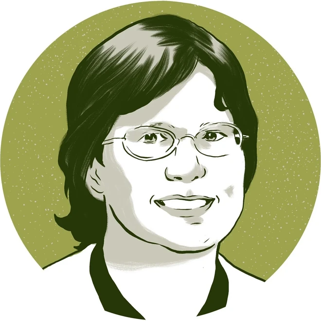
Photograph, then drawing
A photograph of a dental office is a photograph of a dental office. It is accurate and it is cold, and it does the opposite of what a nervous patient needs from a homepage. The same two subjects, drawn, keep every piece of information a patient actually uses — which building, which door, which two people — and drop the parked cars, the overhead wires and the clinical chill.
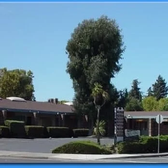
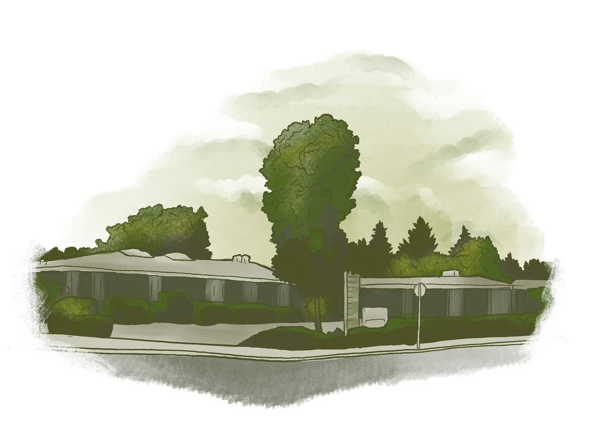
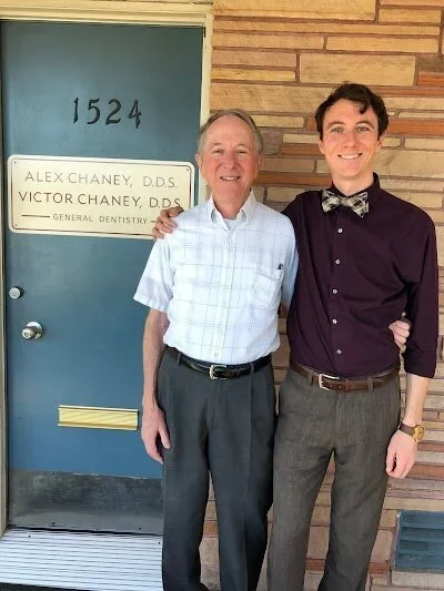
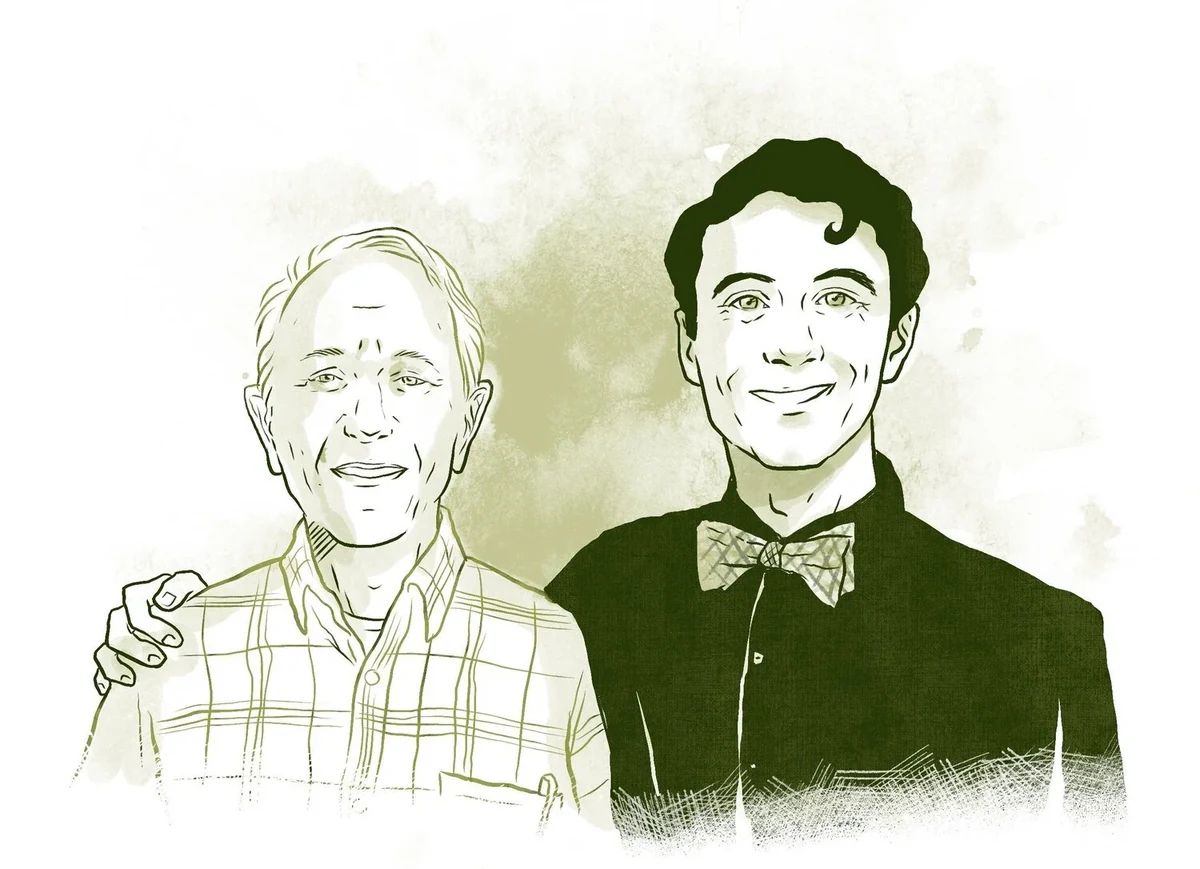
the hero image on the practice site — father and son, from the photograph on the left
Stationery, business cards and appointment cards, all cut from the same palette and the same lockup — and each dentist’s card carries his own portrait, so the drawing is doing identification work, not decoration.
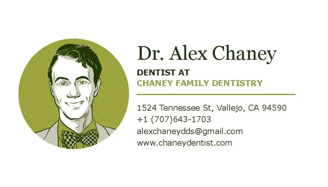
business card, front
why drawing the staff was the cheaper fix, not just the nicer one
The obvious answer to a mismatched team page is a photographer: one afternoon, one lighting setup, everyone in the same chair. For a practice this size that is a day rate, a shoot day the office has to work around, and a re-shoot every time somebody is hired or leaves.
Drawing them cost one pass of my time and produced files the practice owns outright, in their own palette, at any size, with no license attached. A new hire is one more portrait in the same style rather than a reason to book the whole thing again.
what a drawing is allowed to leave out
Compare the two building images closely. The drawing keeps the long low roofline, the entrance, the planting and the tall tree that is the actual landmark you look for from the road. It drops the parked cars, the utility pole, the signage clutter of the neighboring units and the hard midday shadow.
That is the whole argument for illustration in a case like this. A photograph has to include everything in front of the lens, including the parts that make a building look like a strip mall. A drawing includes only what helps somebody find the door.
the honest part
There is no number on this page because there is no number to give. A single-location practice this size was not running analytics I could read before and after, and I did not set up a way to measure whether the refresh brought anyone through the door. The client’s testimonial below is the evidence I actually have, and it is about the experience of the work and the coherence of the result — not about new patients.
Of the print, only the business card is shown. The stationery and appointment-card files are five years old and no longer in my hands, so I would rather show one piece I can put in front of you than describe three.
“Elizabeth did a fantastic job with our website and overall re-branding. I had a lot of older office materials like appointment cards and handouts, but it all looked like it came from different places, and our website didn’t seem to have much of a coherent theme or look. Elizabeth was really helpful in picking out a color theme and making sure to check in at every step along the way. Now everything looks much more coherent and simplified. We’ve since had several very positive comments about our new website and materials. Elizabeth was easy to work with, detailed, and timely. I would highly recommend her for any graphic work.”
— dr alex chaney, chaney family dentistrySee the brand in use
The practice site it was all built for.
open to marketing operations, analytics and martech roles
Let’s talk.
Remote, or Albuquerque and hybrid. If you want the architecture behind any of the work here, ask me and I will walk you through it.